RAM MOUNTS
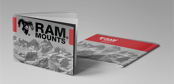
Led a full-scale rebrand of RAM Mounts, singlehandedly redefining the company’s visual identity across all touchpoints, logo system, packaging, digital assets, trade show environments, and print collateral.
Collaborated cross-functionally with sales and product design teams to create a modular system of trade show booths and cohesive packaging for 1,000+ products, directly contributing to a 120% increase in retail placement and significant sales growth.
Drove holistic creative direction across catalogs, global campaigns, and digital marketing initiatives to support market expansion. Directed product photography and developed a consistent visual storytelling framework that elevated brand recognition and customer engagement across channels.

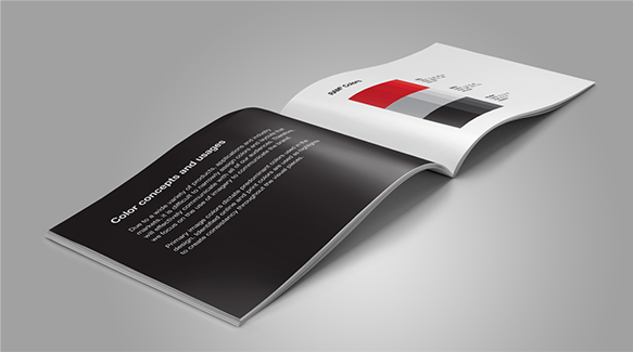
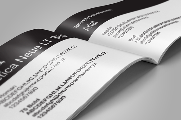
During the logo redesign process, it became clear that no existing brand guidelines were in place, creating a challenge for maintaining consistency. To address this, I led collaborative brainstorming sessions with company leadership and the marketing team to define a new set of brand standards. The result was a refreshed, modern identity and a comprehensive brand guide that offers clarity, consistency, and a visual direction the company is proud to support.
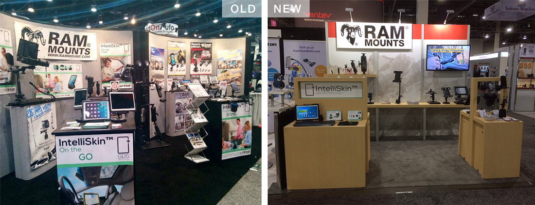
Next, I tackled the outdated trade show booth. With RAM’s product line spanning multiple markets, the new booth needed to be highly modular and adaptable for a wide variety of display needs. Working closely with the trade show coordinator, I gathered feedback from the sales team, those on the front lines at events, to ensure the final design met their needs and effectively showcased our full product range.
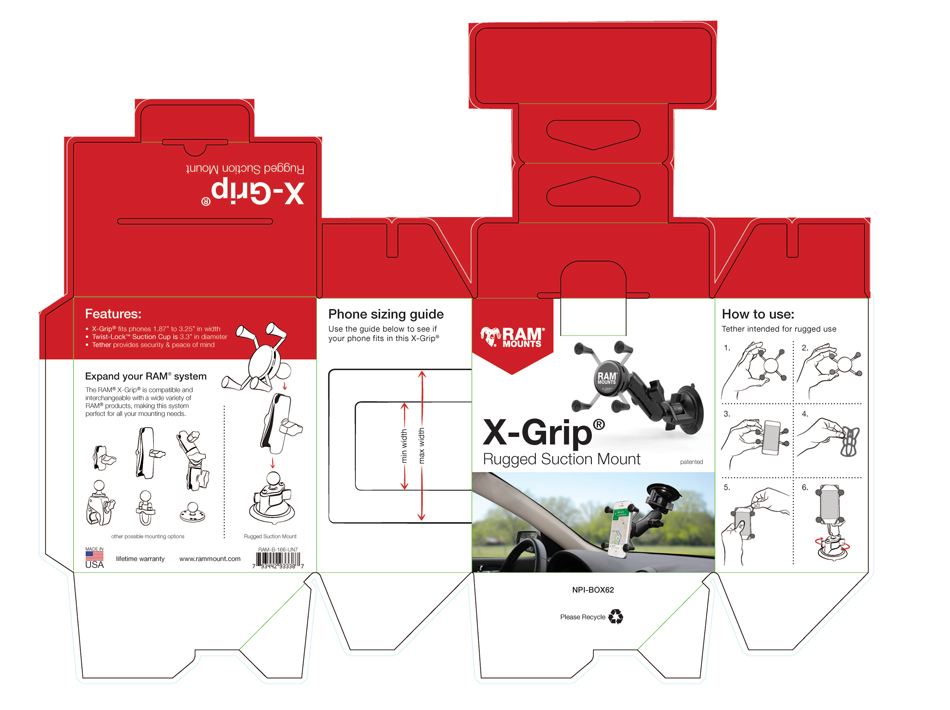
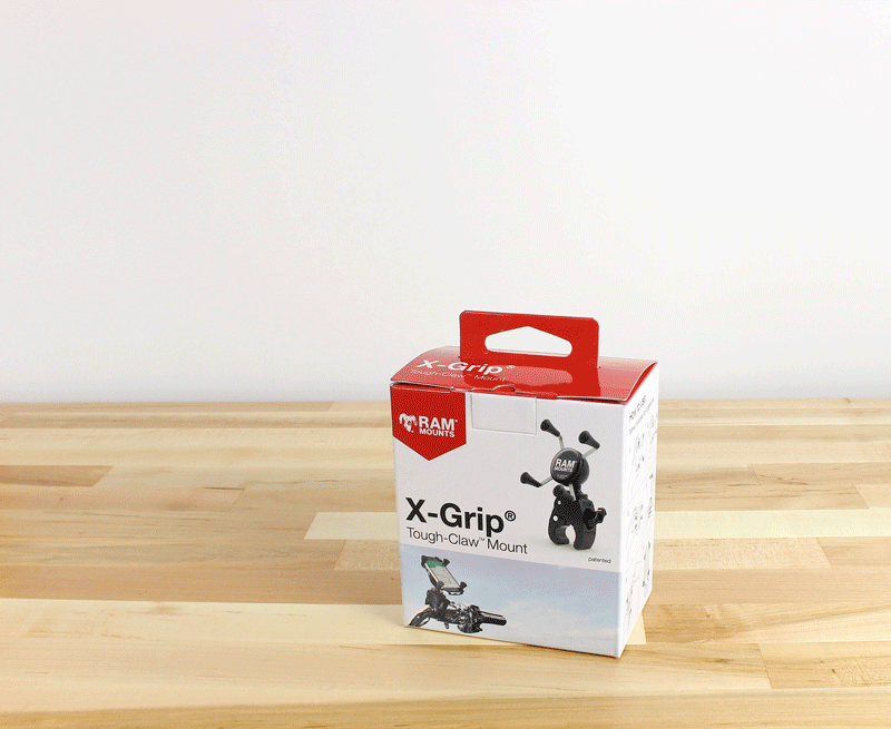
A true brand refresh isn’t complete without updated packaging. To demonstrate the value of this initiative, I designed new packaging for RAM’s top-selling products. Since the products are all black, and we wanted to maintain a light and clean aesthetic, I developed a custom illustration style that clearly showcased each item while aligning with the brand’s updated visual tone. The result: a 120% increase in sales for those featured products.


©CHRISJKENT2025